Milestone 2

The Carbon Effect

Group P1-10
Tan Quixing Michelle - 1901861
The Nu Win - 1901854
Daren Puan - 1901822

Content

  • Problem
  • Graph 1
  • Graph 2
  • Proposal
  • Q&A

Problem

Global warming poses significant challenges to society at every level and has been causing an increase in the average temperature of the world. Humans are further increasing the rate of global warming with their various activities.

Annual Greenhouse Gas Index

Data (What)

  • Quantitative & Ordinal
    • Years, Radiative Forcing, AGGI

  • Quanlitative & Categorical
    • The different type of greenhouse gases

How (Idiom)

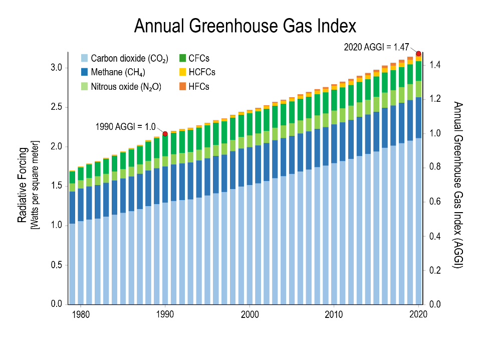
The visualization is represented as a stacked bar chart. Color is used to differentiate the different greenhouse gases on the stacked bar chart.

Task (Why)

Shows the warming influence of greenhouse gases in the atmosphere from 1980 to 2020.

The warming influence of greenhouse gases in the atmosphere has increased substantially over the last several decades.

Problems

  • Hard to read
  • Difficult to compare each segment
  • Higher error possibility
  • Too much effort to understand the trend

Suggestions

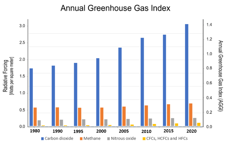
Aggregated Bar Chart

  • Show each data category in a frequency distribution
  • Added grid lines to guide viewers to see the value
  • Took only a few years data and combined a few gases. to avoid the graph being too cluttered

Global Warming

Data (What)

  • Ordinal
    • Global Mean Temperature
    • Year
    • Month

How (Idiom)

  • Use infographic
  • One circle represent: year and has 12 segments: represent months
  • In clockwise direction: 1 o’clock is January
  • Temperature is represented using two hues as a gradient: blue for the lowest and red for highest

Task (Why)

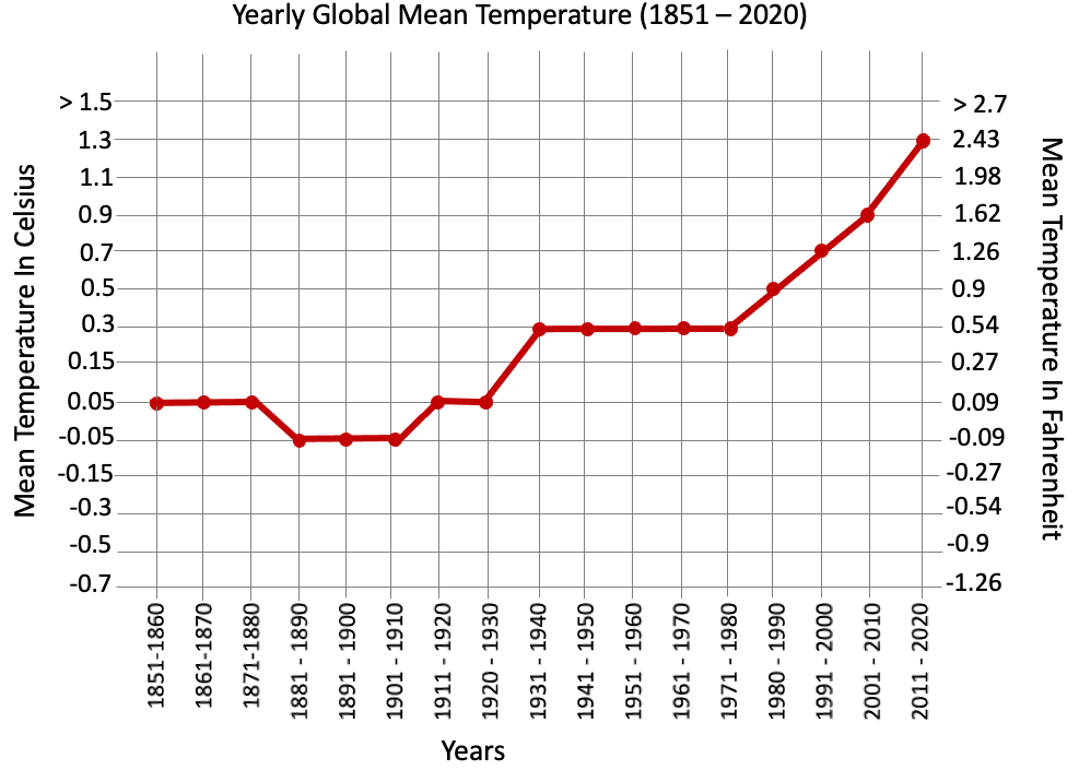
Yearly average global temperature has been increased drastically (Benchmark: pre-industrial revolution 1851-1900)

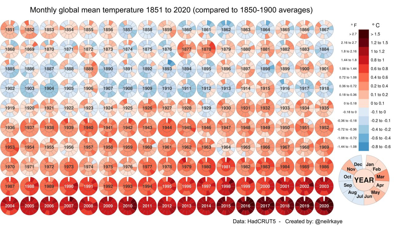
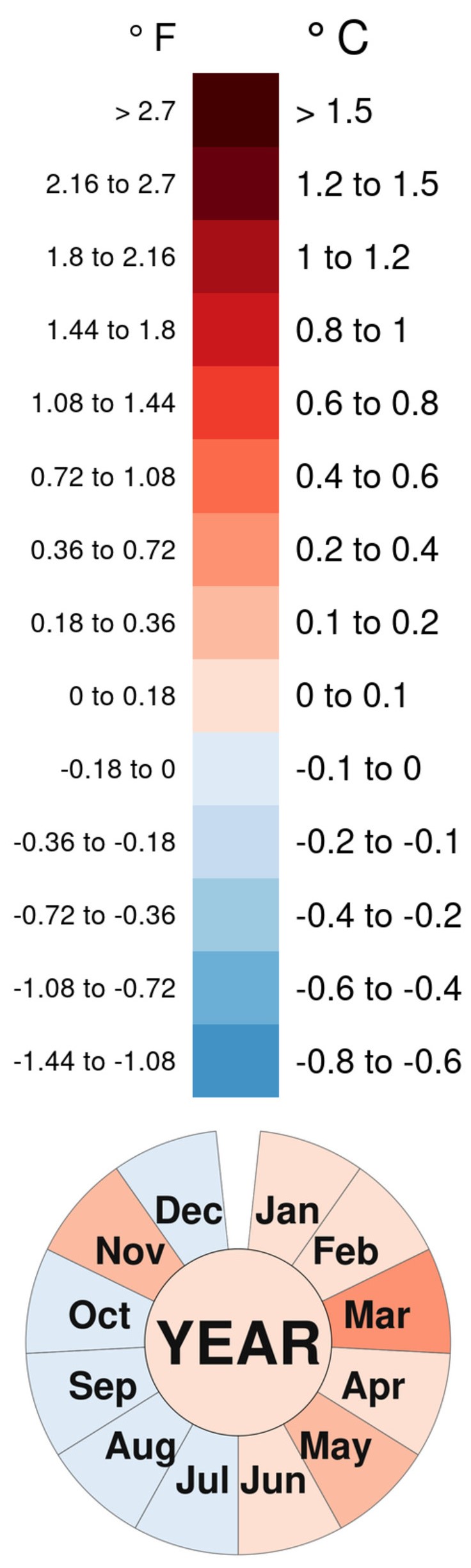
Monthly global temperature has increased sharply after 1930 (Third Industrial Revolution)

With industrial revolution development, the global warming was escalated

Problems

  • Too many nested circles
  • Not sure what it is trying to convey
  • Different saturation levels makes it hard to read the temperatures

Suggestions

  • Overview chart: Per decade global mean temperature
    • See the trends of the temperature
    • Easily read the temperature in both Celsius and Fahrenheit
  • In details chart: Monthly Global Mean Temperature
    • Dropdown to select year
    • Easily read the temperature in both Celsius and Fahrenheit

Proposal

Q&A